Work

Most of the following projects are highlights from my current in-house role as Senior Graphic Designer at GSA, a UK housing association. See the About section for details.

Embedding culture and behaviours

Brief: To create a distinct identity for ‘The GSA Way’ that would foster a shared culture and values among a newly merged, diverse workforce.

Approach: I developed a vibrant visual system using geometric shapes and a bold palette. ‘Growth’ is a key theme, so I created an organic yet graphic motif to illustrate the organisation’s aim for its own evolution and staff development in a way that felt actionable and modern. A truly multi-channel campaign, other work included a browser-based game, a new hub on the SharePoint intranet, environmental graphics, direct mail to staff at home, email campaigns and PowerPoint presentations.

Outcome: This project solidified a sense of belonging across disparate teams, directly contributing to improved internal morale and staff retention rates. It provided GSA with a tangible cultural framework, making the abstract concept of ‘company values’ feel real and accessible to every employee. My work was designed to permeate the daily workspace, keeping the culture ‘top of mind.’
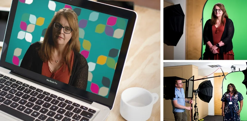
Professional video production layout illustrating the transition from raw green screen capture to a polished, branded motion graphic background.
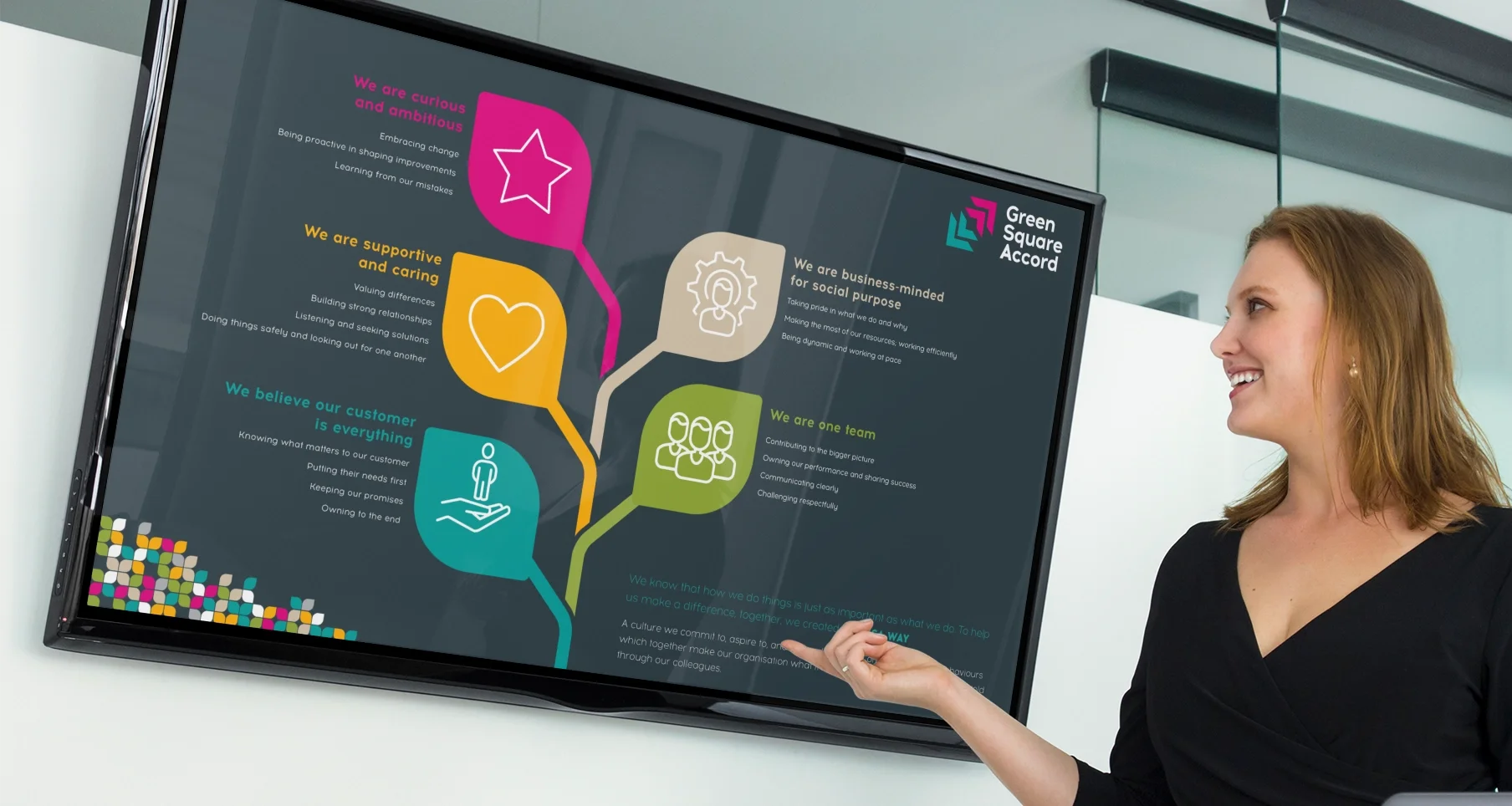
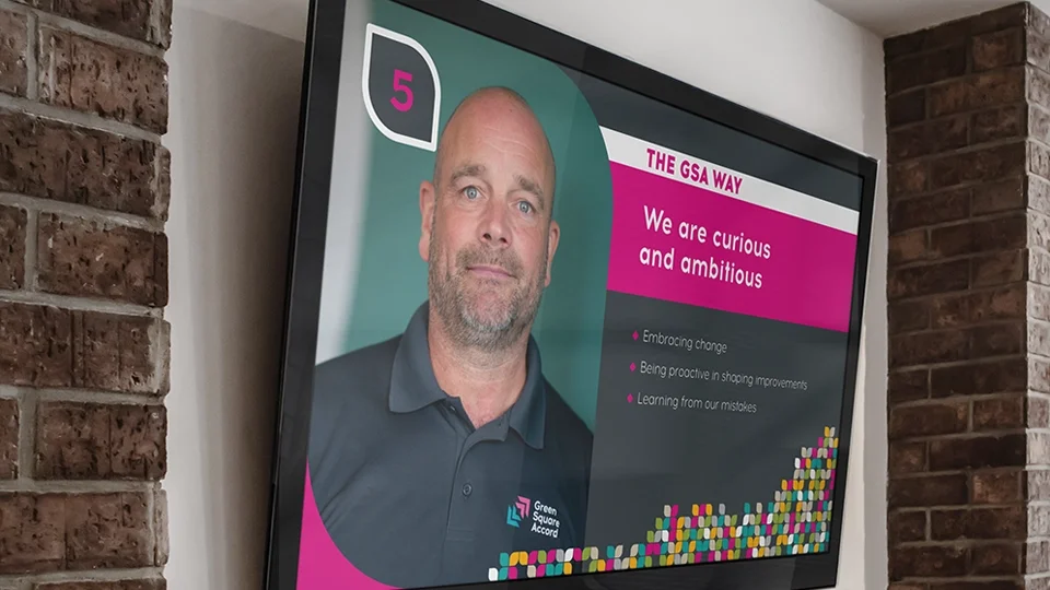
Digital display design using dynamic organic shapes, bold typography, and high-contrast color blocks to enhance readability in office spaces.
Complex information architecture visualized as a custom infographic tree, using a balanced color palette and clear typographic hierarchy.
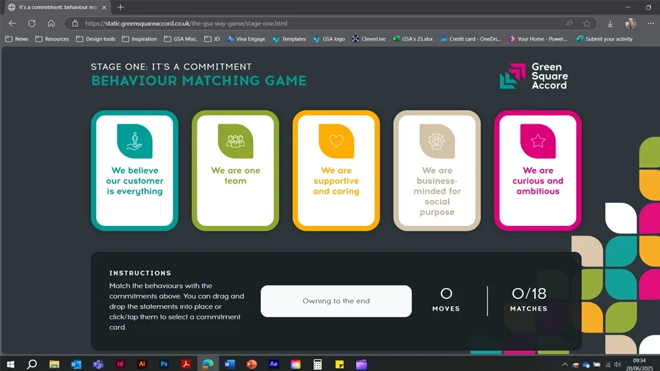
UI/UX design showcasing a vibrant, color-coded card system with rounded corners and intuitive flat-design icons for digital engagement.
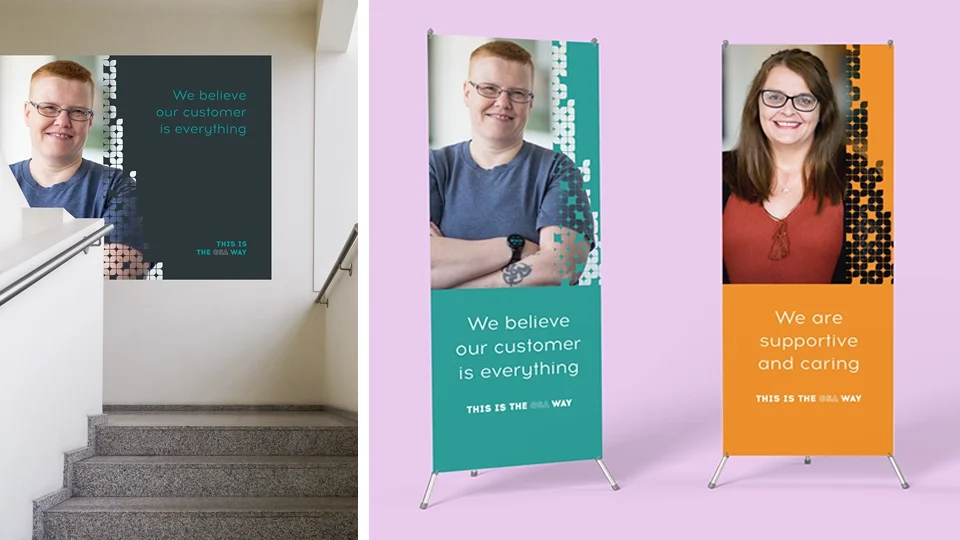
Large-format environmental graphics showcasing consistent brand application across textured wall vinyls and sleek exhibition banners.
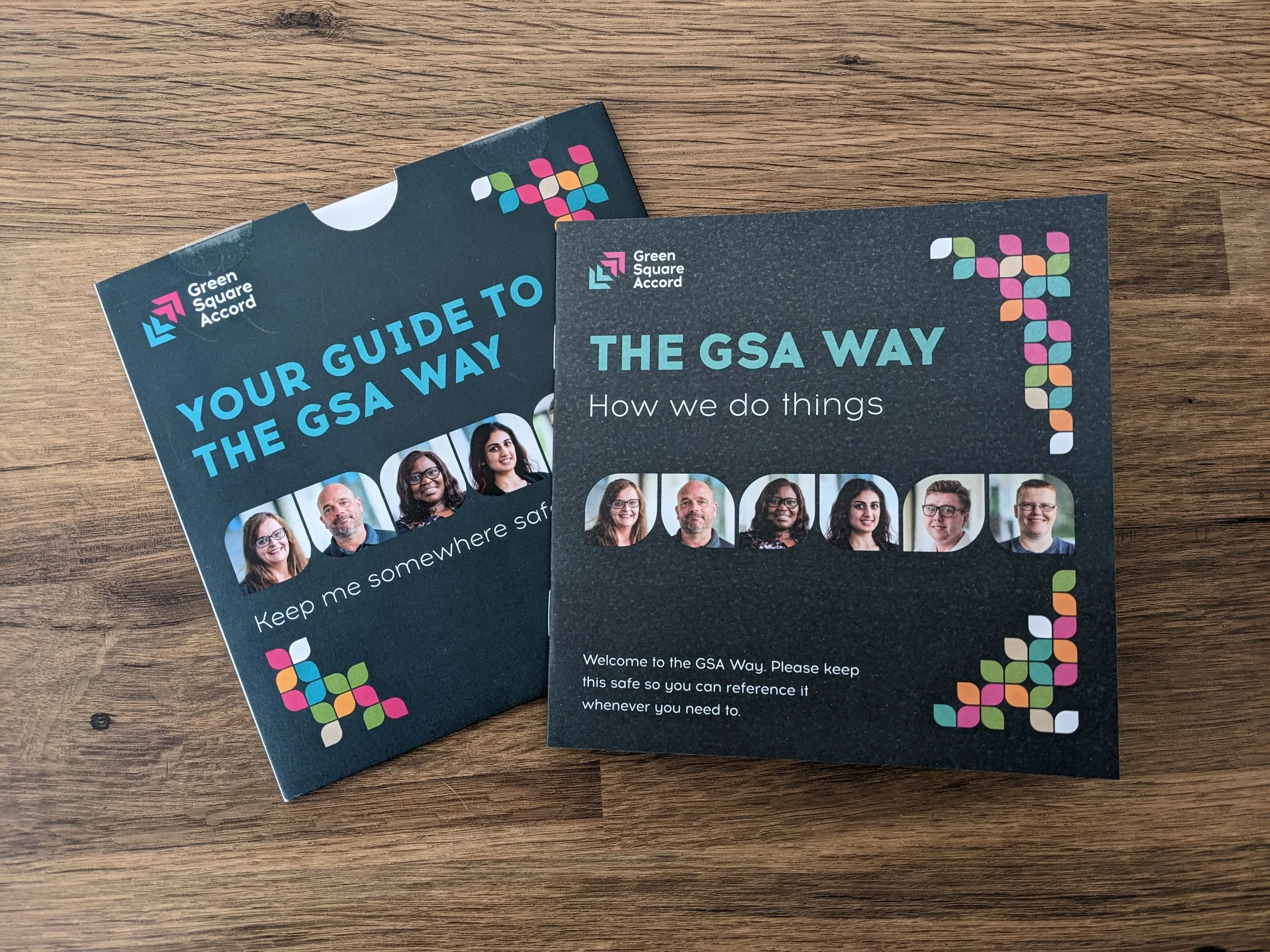
Two informational brochures about the GSA Way, featuring group photos of six diverse people, on a wooden surface.
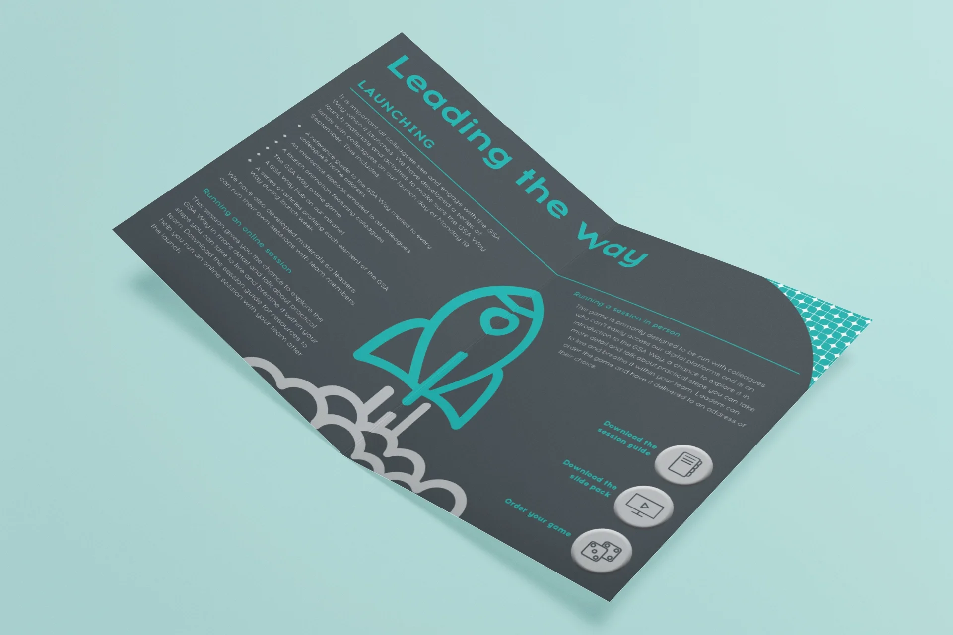
Editorial layout featuring a dark charcoal palette, vibrant cyan accents, and clean vector iconography for a modern brand aesthetic.

Launching a five-year business strategy

Brief: To transform a complex corporate strategy into an engaging and accessible visual narrative for colleagues and stakeholders.

Approach: The strategy has four main objectives, so I created a single identity with four colour-coded elements, allowing each objective to be ‘split out’ and reported on separately. By breaking down complex strategic goals into digestible infographics and clear milestones, I ensured the information easy to follow. Assets included interactive PDFs, motion graphics for a televised presentation, and regular update decks and reports.

Outcome: This approach drove significantly higher engagement compared to redundant, pre-merger strategies, ensuring colleagues and stakeholders felt aligned with the new corporate vision. For GSA, this meant improved transparency and a more informed workforce. This project won a Gold award in the Best Business Change category at Communicate Magazine’s Internal Comms & Engagement (ICE) Awards.
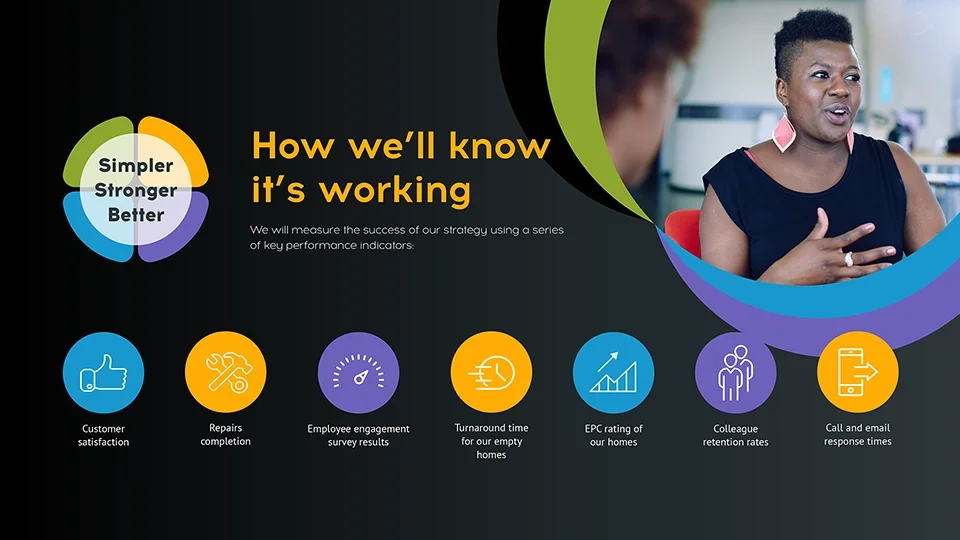
KPI dashboard design featuring a vibrant row of flat-design circular icons, integrated photography, and a clear typographic structure for data visualization.
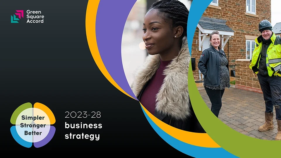
Modern business strategy document cover design using dynamic curved masking, professional photography, and a vibrant primary-color brand palette.
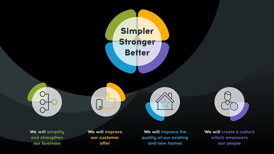
Informational graphic design showcasing a four-pillared corporate strategy with clean vector iconography and a balanced, symmetrical composition.
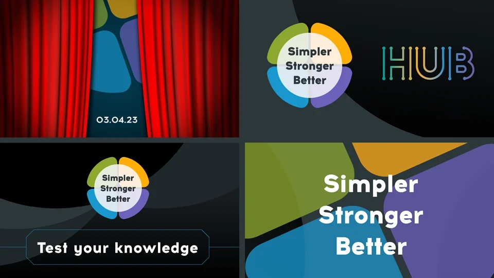
Collection of digital brand assets and UI components featuring "Simpler Stronger Better" branding with elegant line-art iconography and bold color blocks.
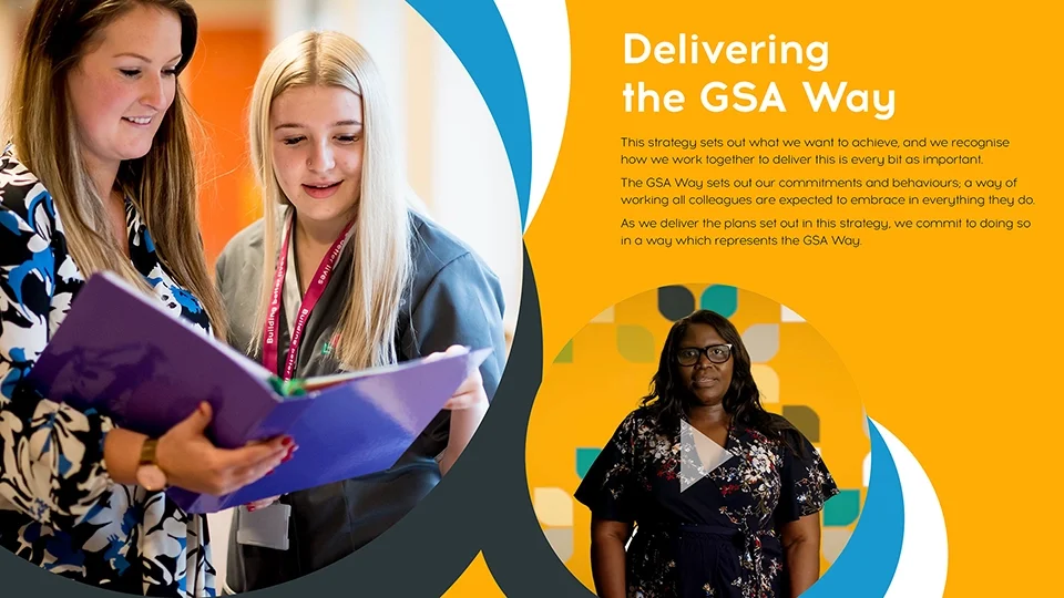
Clean internal communications layout featuring warm photography, rounded graphic frames, and a bold yellow-and-white color block for high legibility.
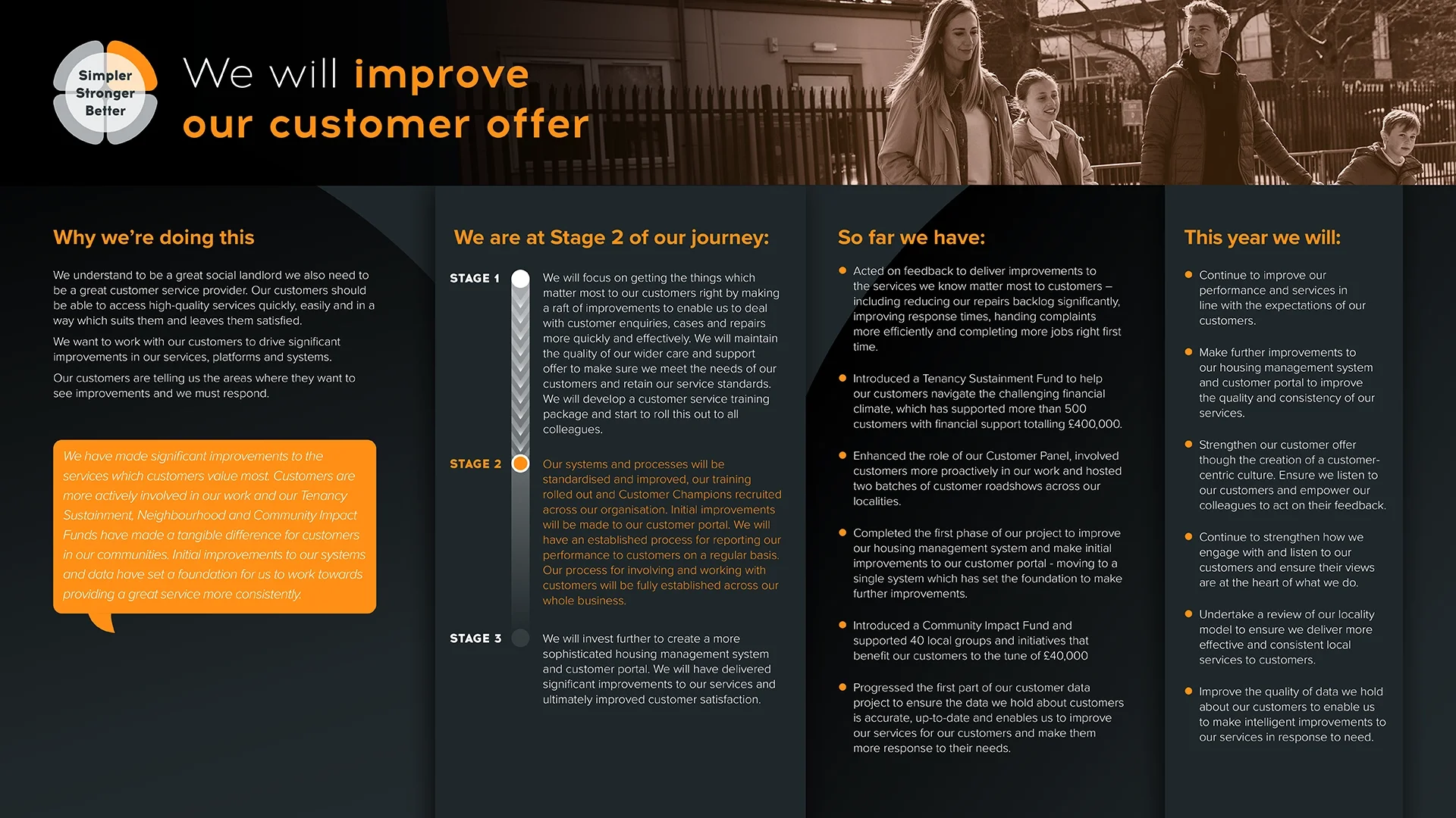
A corporate presentation slide titled 'We will improve our customer offer' with sections outlining the company's reasons for improvement, their journey stages, achievements, and future goals. The slide includes headings, bullet points, and a small logo in the top left corner that says 'Simpler Stronger Better' with a circular graphic.
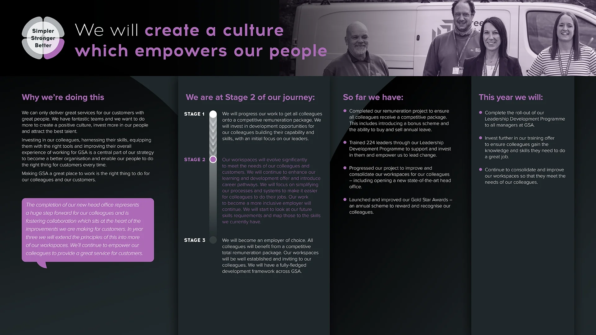
A group of four people standing outdoors near a van, smiling, with a banner overhead that reads, 'We will create a culture which empowers our people,' in front of a black background.

The GSAs

Brief: A celebratory brand identity for 'The GSAs' (Gold Star Awards), GSA’s annual colleague awards ceremony.

Approach: I provide the event with its own distinct, elevated personality. I created a versatile design toolkit that ensures a seamless brand experience across every touchpoint, from high-impact video editing of the live ceremony to tactile, keepsake items for the winners. I promote the event with posters, office screens, intranet assets and social media posts, and I print-manage all medals, trophies and certificates. I also help to host the event in-person.

Outcome: My design work gives the awards a professional and uplifting backdrop that fosters a shared sense of pride among 1,600 colleagues, directly supporting cultural integration and employee engagement. This strengthens colleagues’ grasp of the GSA brand and, in turn, transforms a standard staff event into a powerful tool for retention and advocacy.
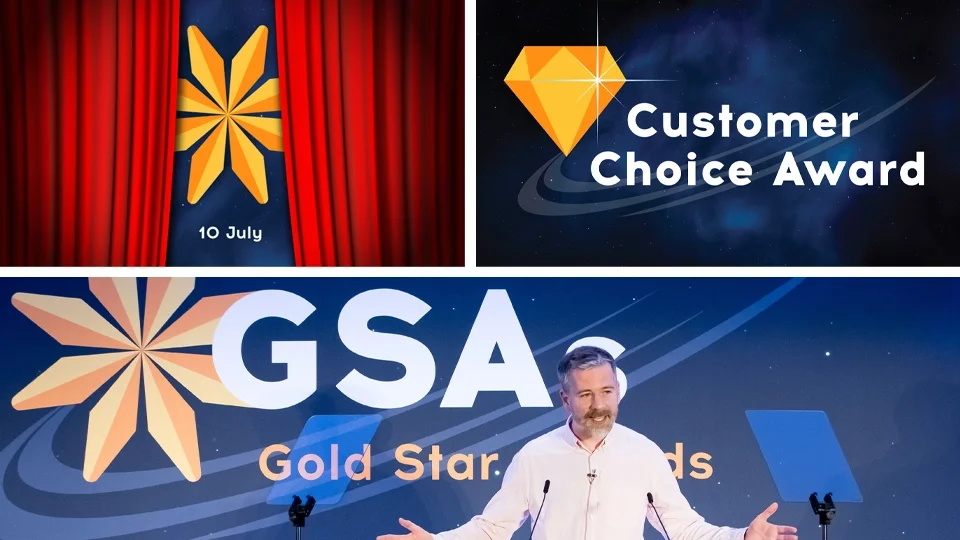
A man giving a speech at an award event with GSA branding, standing in front of a blue backdrop with the GSA logo, and two screens displaying the words 'Customer Choice Award' and a diamond icon, with a date of July 10.
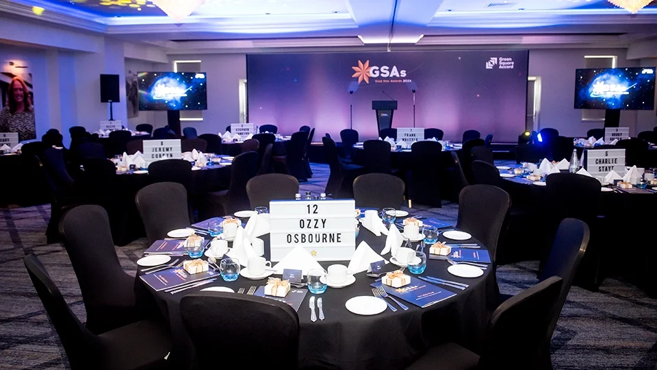
A wide-angle view of a professionally designed event space. The design features cohesive branding from the large-scale stage backdrop to the individual table markers and printed menus, all utilizing a deep blue and gold celestial color palette.
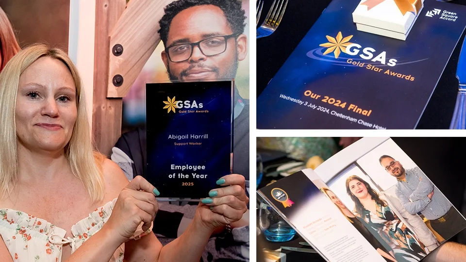
A woman holding a plaque that reads 'Employee of the Year 2025' at an award event, with a man in the background, and additional images of event materials and photos on the table.
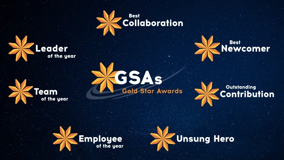
Award chart for GSA Gold Star Awards with categories: Best Collaboration, Best Newcomer, Outstanding Contribution, Unsung Hero, Employee of the Year, Team of the Year, and Leader of the Year, all represented with star icons, set against a starry night background.
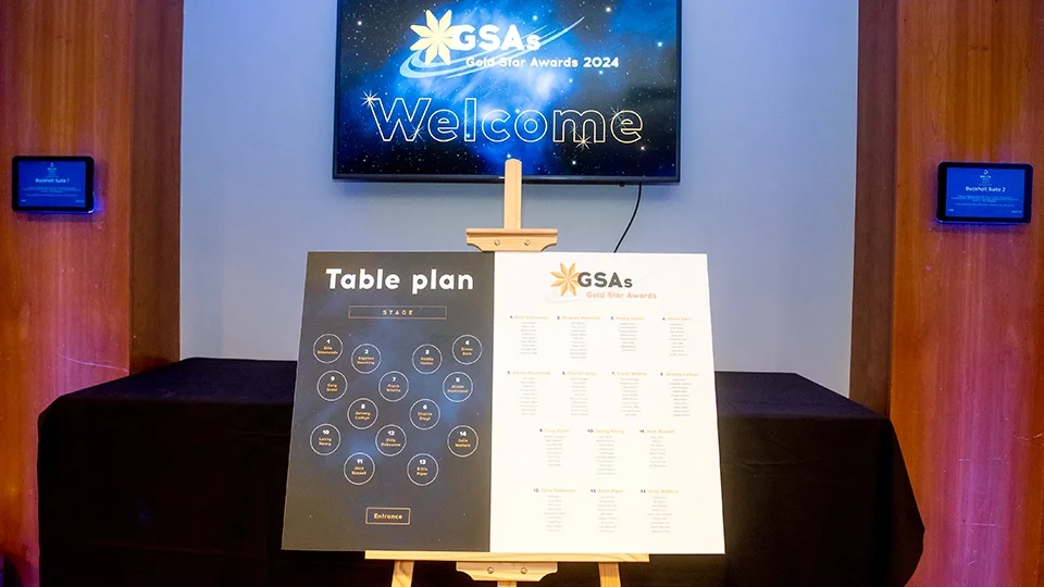
A minimalist and functional table plan design displayed on an easel. The layout uses a sophisticated dark-to-light split design, with a geometric seating map on the left and a clean, legible typographic list of guests on the right.
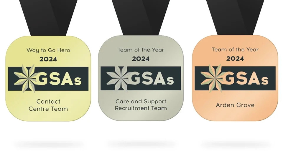
A flat lay design of three custom commemorative medals in gold, silver, and bronze. The design features a bold black horizontal band with the "GSAs" logo and the year 2024, demonstrating consistent brand application across physical event collateral.

Reporting and data visualisation
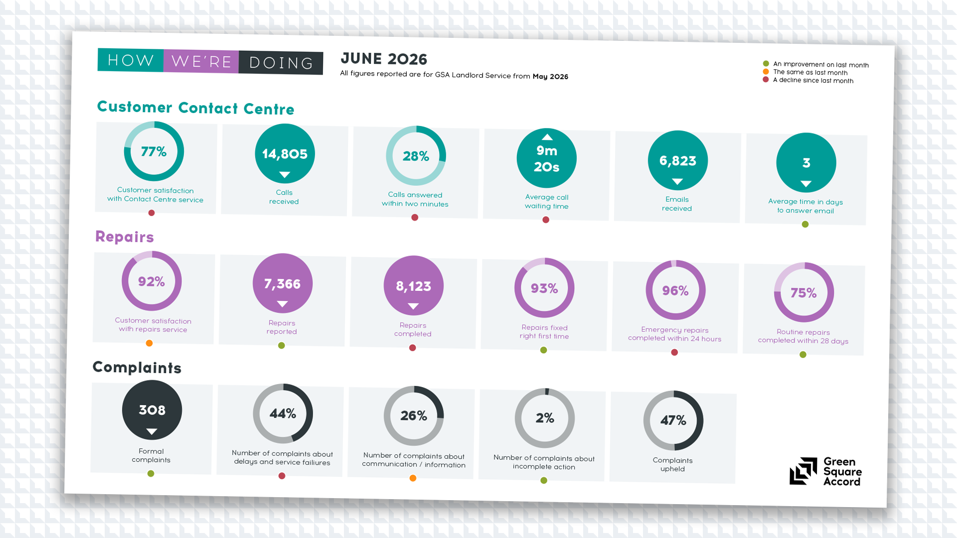
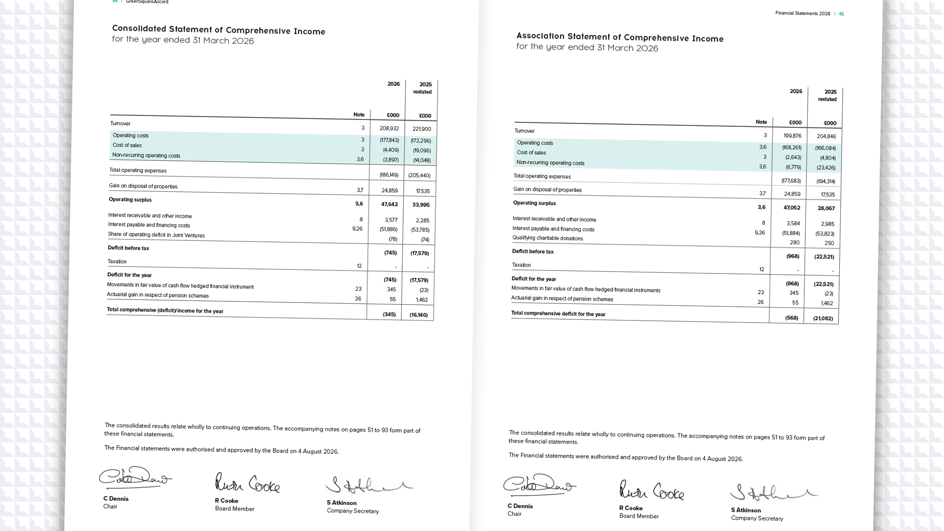
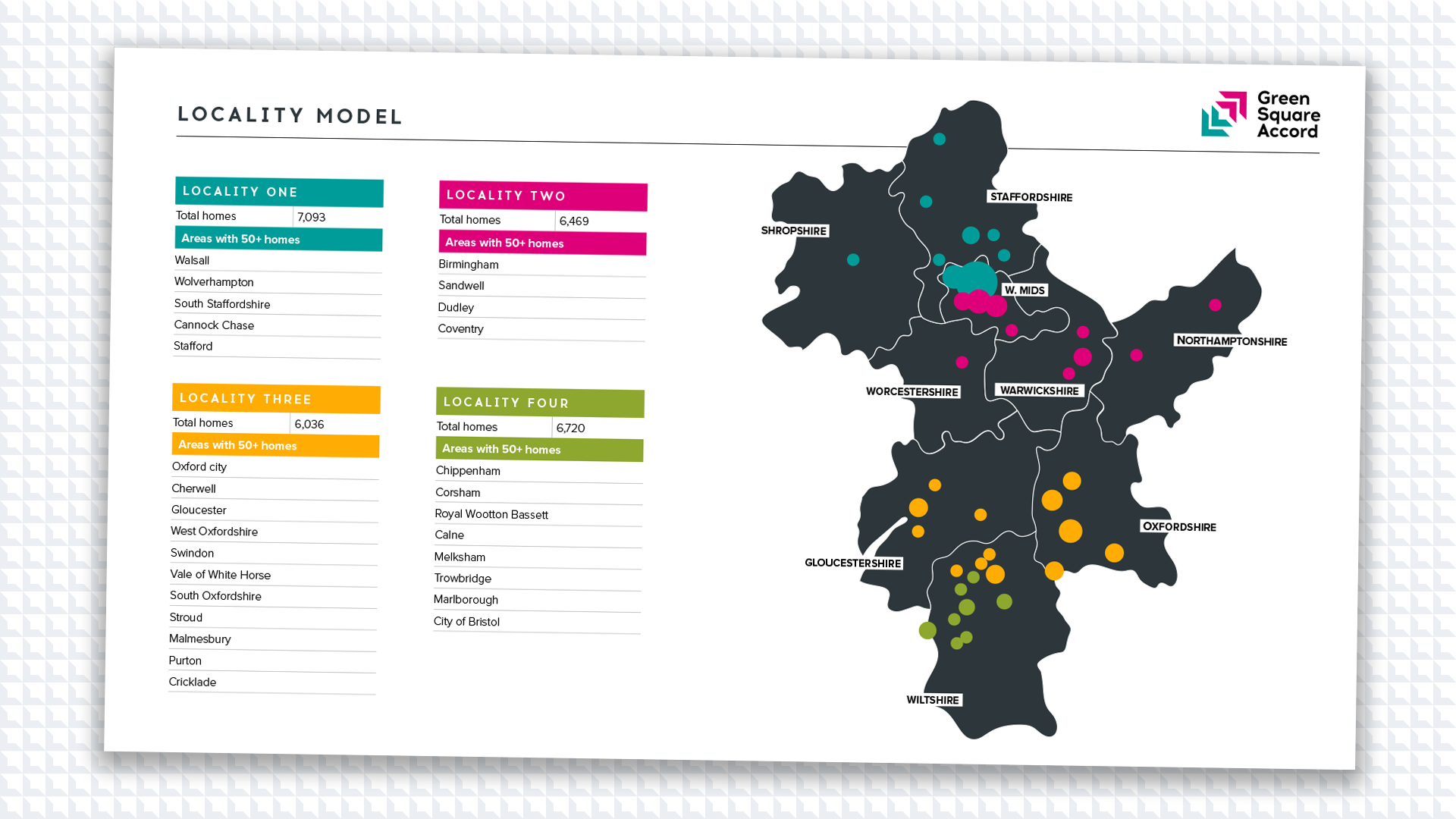
Data is only as powerful as its clarity. I transform dense statistics, complex financials and raw survey insights into engaging visual stories that audiences want to read. Thoughtful information design with structured hierarchy and technical precision drives understanding, so findings land with impact.
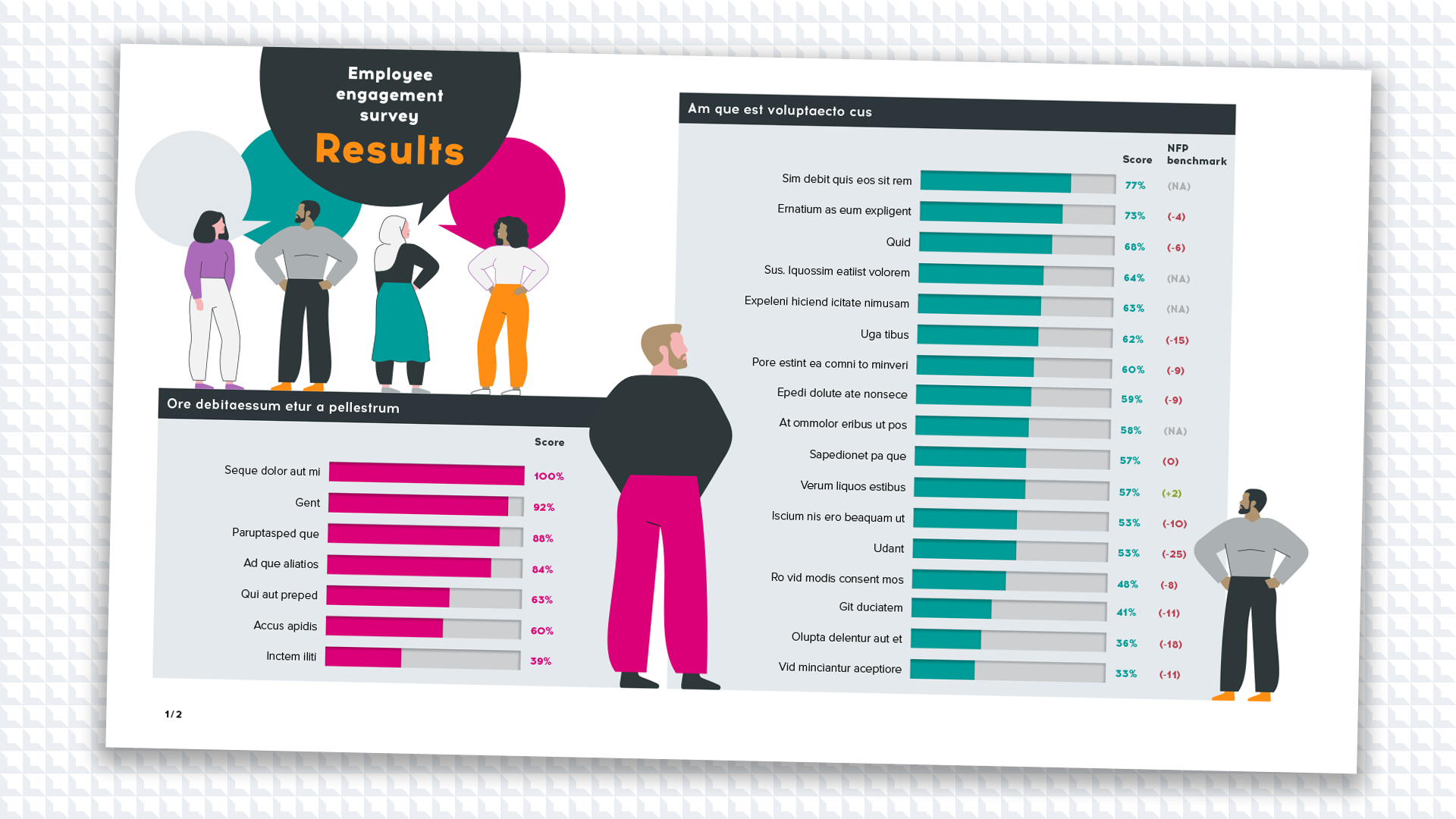
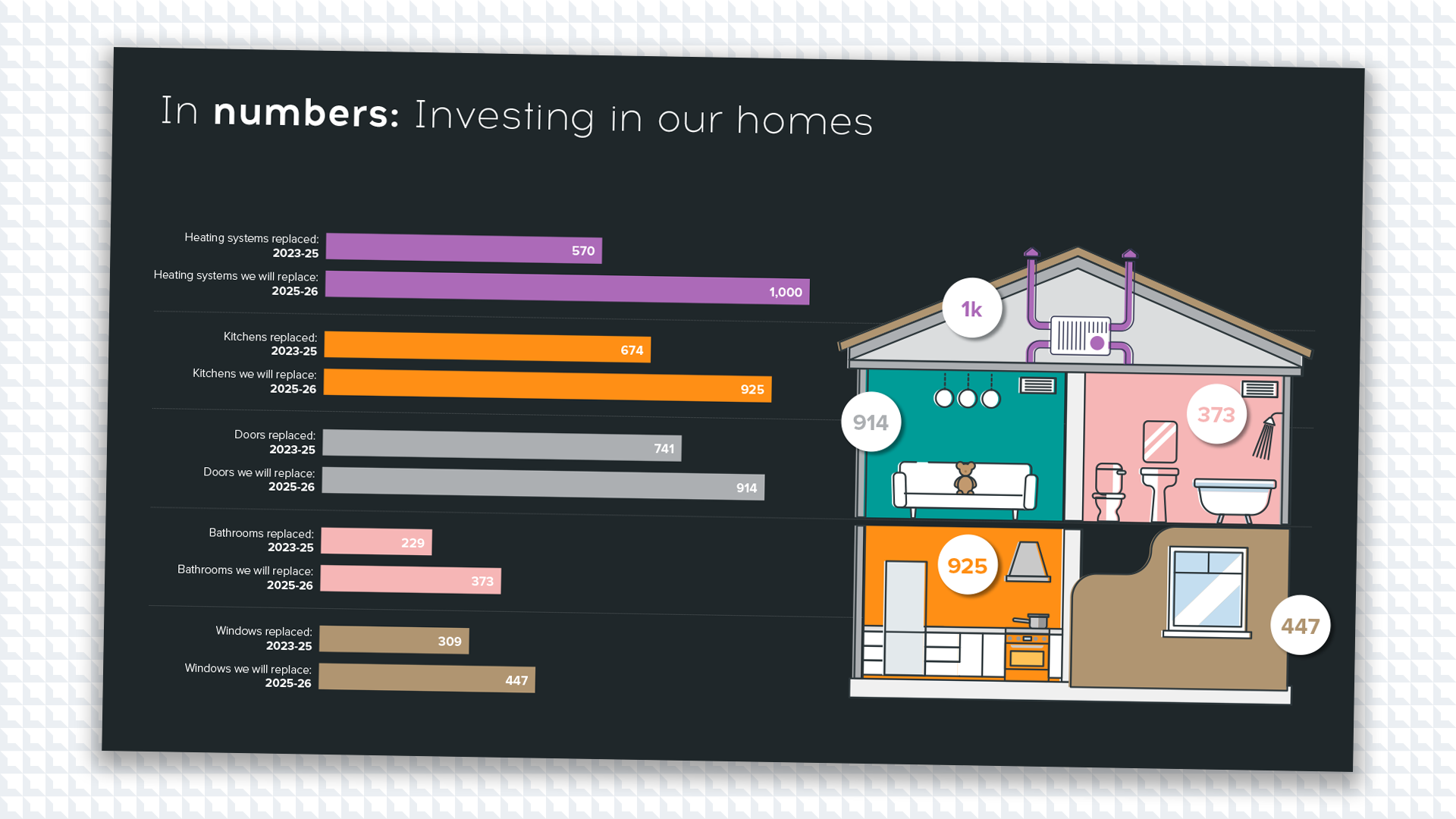
Moving to a new head office

Brief: When GSA consolidated its legacy offices and moved into a new, single head office at ‘X Brindleyplace’, I was tasked with creating a project identity and information campaign to unify a transitioning workforce within a cohesive, professional environment.

Approach: My creative process mapped the user journey. The main focus was on an interactive colleague guide that explained the benefits of the new space alongside clear logistical info, such as workspace layouts, transport links and new desk/room booking tech. Alongside the guide, I created intranet and social media assets that teased the move and generated excitement. I also joined the moving committee and hosted open mornings at the new space.

Outcome: An immersive campaign that successfully fostered a sense of identity and pride among colleagues during a major transition. By delivering a high-impact, consistent campaign, I reinforced GSA’s brand value of ‘business-minded for social purpose’ and directly supported a smooth transition, allowing colleagues to ‘hit the ground running’ on moving day.
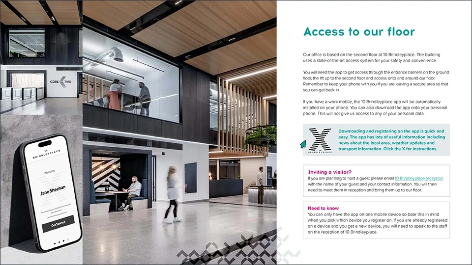
An editorial page layout titled "Access to our floor." The design balances clean typography and instructional text with a multi-image montage of office interiors and a mobile app UI mockup.
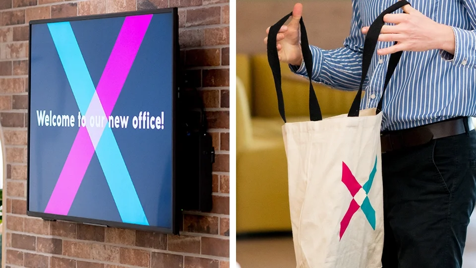
Left side: a digital screen on a brick wall displaying a colorful X logo with the text "Welcome to our new office!". Right side: a person wearing a blue striped shirt holding a white tote bag with the same X logo.
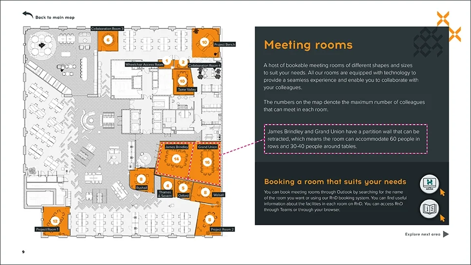
A detailed architectural floor plan design for meeting rooms. The layout uses a sophisticated grey and orange color palette, featuring a numbered legend and custom iconography for a seamless user experience.
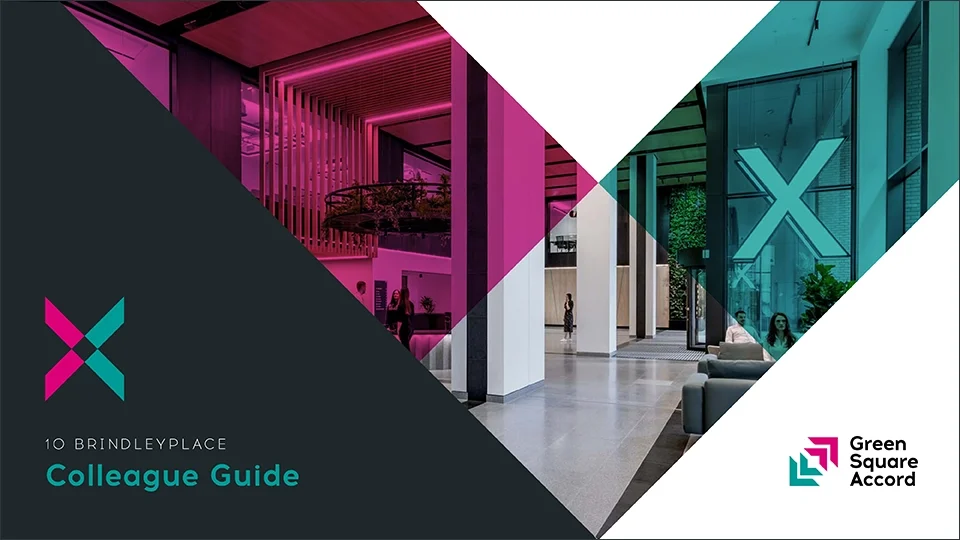
The cover of the 10 Brindleyplace Colleague Guide, featuring a dynamic geometric mask in the shape of an "X" that overlays a modern office interior with pink and teal color grading.
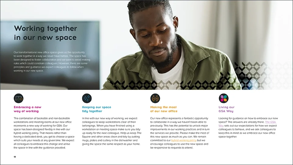
A brand-focused informational page titled "Working together in our new space." It features a lifestyle hero image with a stylized graphic overlay and a four-column grid layout for core company principles, each accompanied by a custom colorful icon.
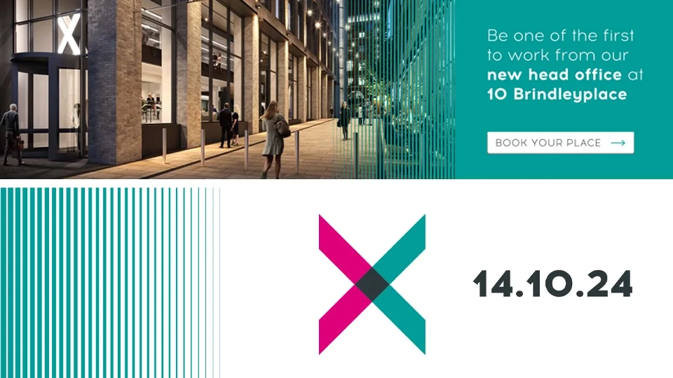
Email banners for 10 Brindleyplace with people walking outside, and a promotional message inviting to book a place, along with a stylized 'X' logo and the date 14.10.24.

Logos

My creative approach with logos begins with an immersion into the client’s/project’s values, vision and audience, using a brand questionnaire I devised myself. I prioritise 'visual longevity' over design trends, and I take a pragmatic approach to ensure clarity across different touchpoints and colour modes. What I enjoy most about logo design is communicating value at a glance and having my work nurture brand growth and long-term recognition.
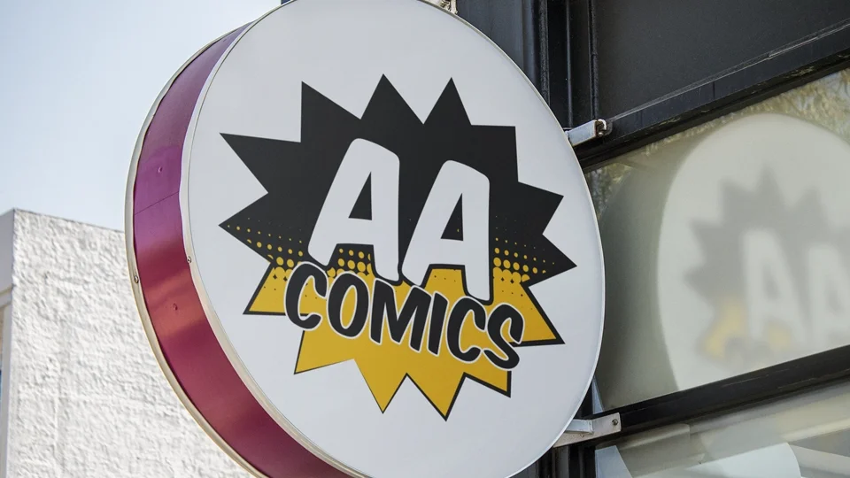
Vibrant comic book style logo for AA Comics in Wolverhampton UK with a black and yellow starburst background and bold "AA COMICS" typography on a circular outdoor storefront sign.
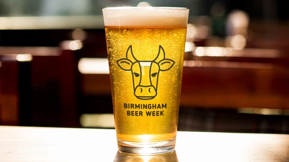
Minimalist line-art logo of a bull head with a beer glass integrated into the forehead, printed on a pint of lager for Birmingham Beer Week branding.
ndustrial-style black circular sticker logo featuring a bicycle chain icon and bold white graffiti-inspired typography on a yellow post.
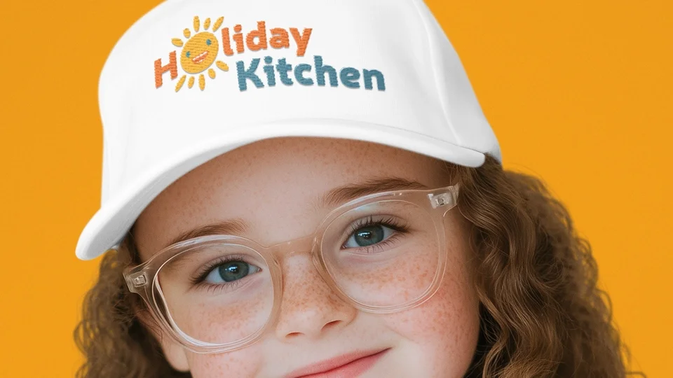
Playful, embroidered logo for Holiday Kitchen featuring a sun character and colorful typography on a white baseball cap worn by a child.
Earth-toned branding for Homescape featuring a crossed hammer and garden fork icon with clean sans-serif typography on an olive green work t-shirt.
Modern geometric logo using teal and magenta bars on a professional ID badge lanyard for the Equality Diversity and Inclusion Forum.
Vintage-inspired green armchair silhouette logo with serif and script typography for Already Loved Furniture, displayed over a black and white workshop photo.

Refreshing an existing brand

Brief: Gloucestershire Domestic Abuse Support Service (GDASS) is managed by GSA. When their funding contract was renewed, I was tasked with refreshing their existing brand to improve its visibility.

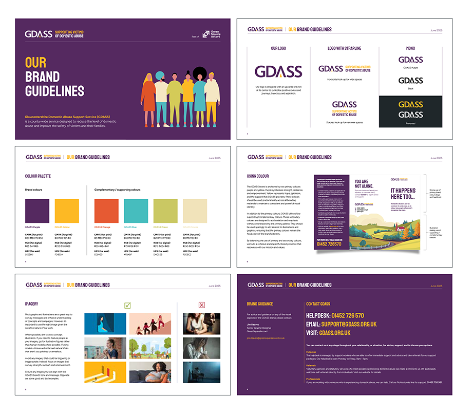
Approach: I consulted with the GDASS team about the history of the service, its impact in the community, and their hopes for the future. I then undertook an extensive brand audit, evaluating typography, colour and existing outputs for print and social media. I created new brand guidelines, developing a punchier colour palette, impactful typefaces, styles of illustration, and tweaks to the logo. I set the team up with a brand kit on Canva, allowing them to self-serve and design their own marketing tools. I also art-directed an updated website, working with our in-house web developer.

Outcome: GDASS is now more recognisable in the Gloucester area and further afield. Improvements to the brand led to a visit from HRH The Queen in late 2025, where my work on the refreshed brand served as an impactful backdrop for photographs. Since launch, I have also supported GDASS with various marketing campaigns, designing print and digital assets.
GDASS logo with text supporting victims of domestic abuse, and illustrations of diverse people standing side by side.
GDASS support for victims of domestic abuse brand guidelines, including logo variations, color palette, imagery, and contact information.
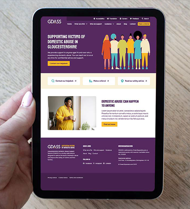
Tablet screen displaying a website supporting victims of domestic abuse in Gloucestershire, featuring a purple and yellow color scheme, with illustrations at the top and an image of a woman in yellow holding a mug.
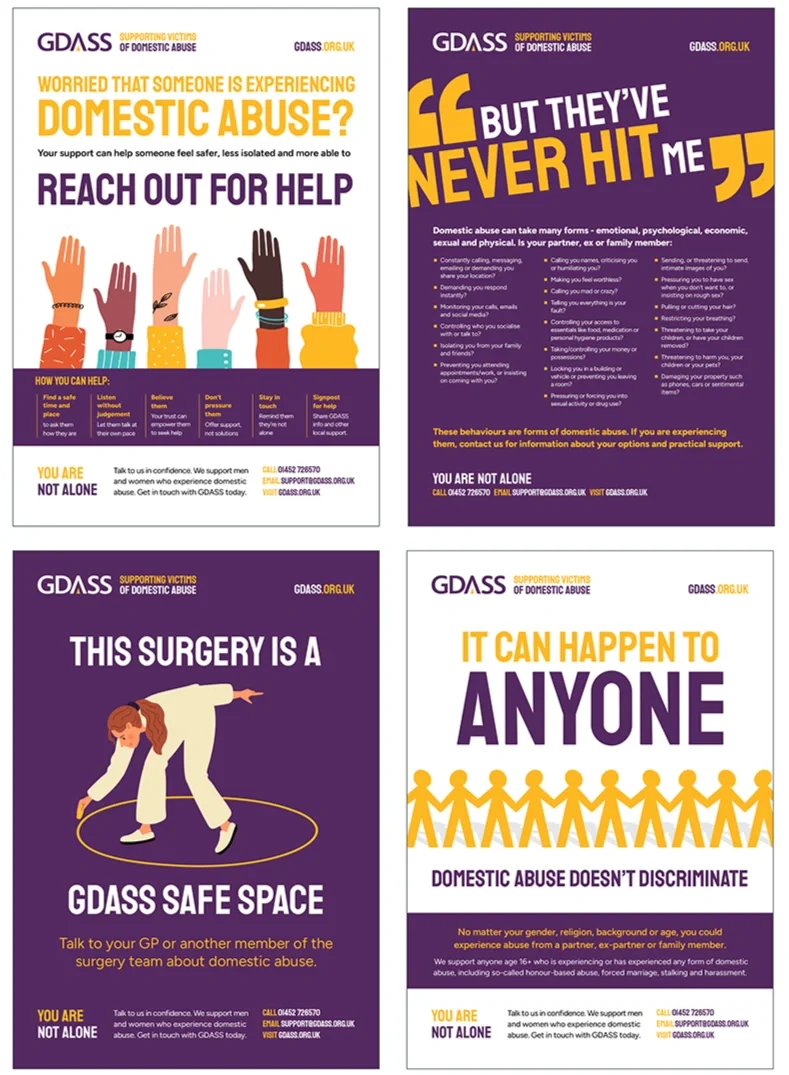
A four-panel poster campaign by GDASS supporting victims of domestic abuse. The posters provide information on how to recognize abuse, seek help, and the importance of safe spaces, emphasizing that domestic abuse can happen to anyone and encouraging victims to reach out for help.

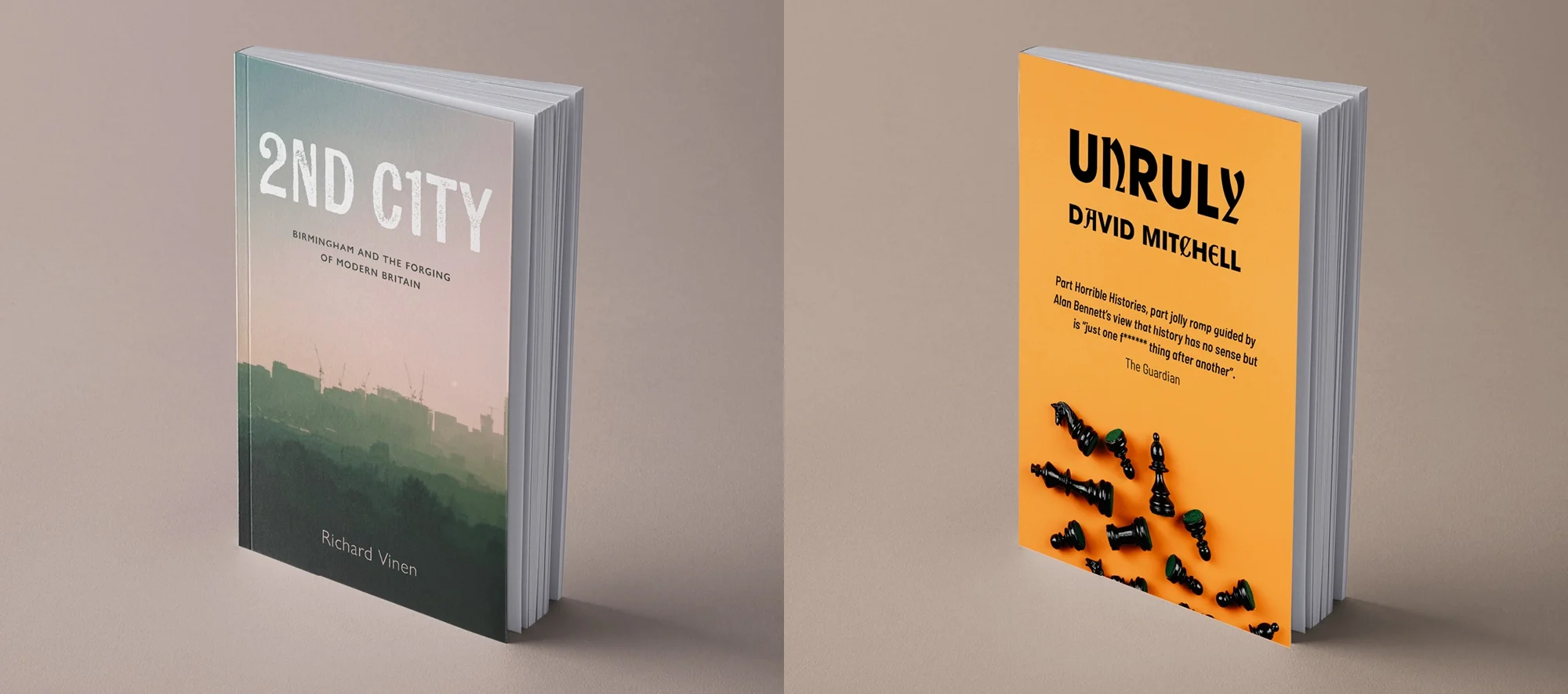
Rapid-fire book covers

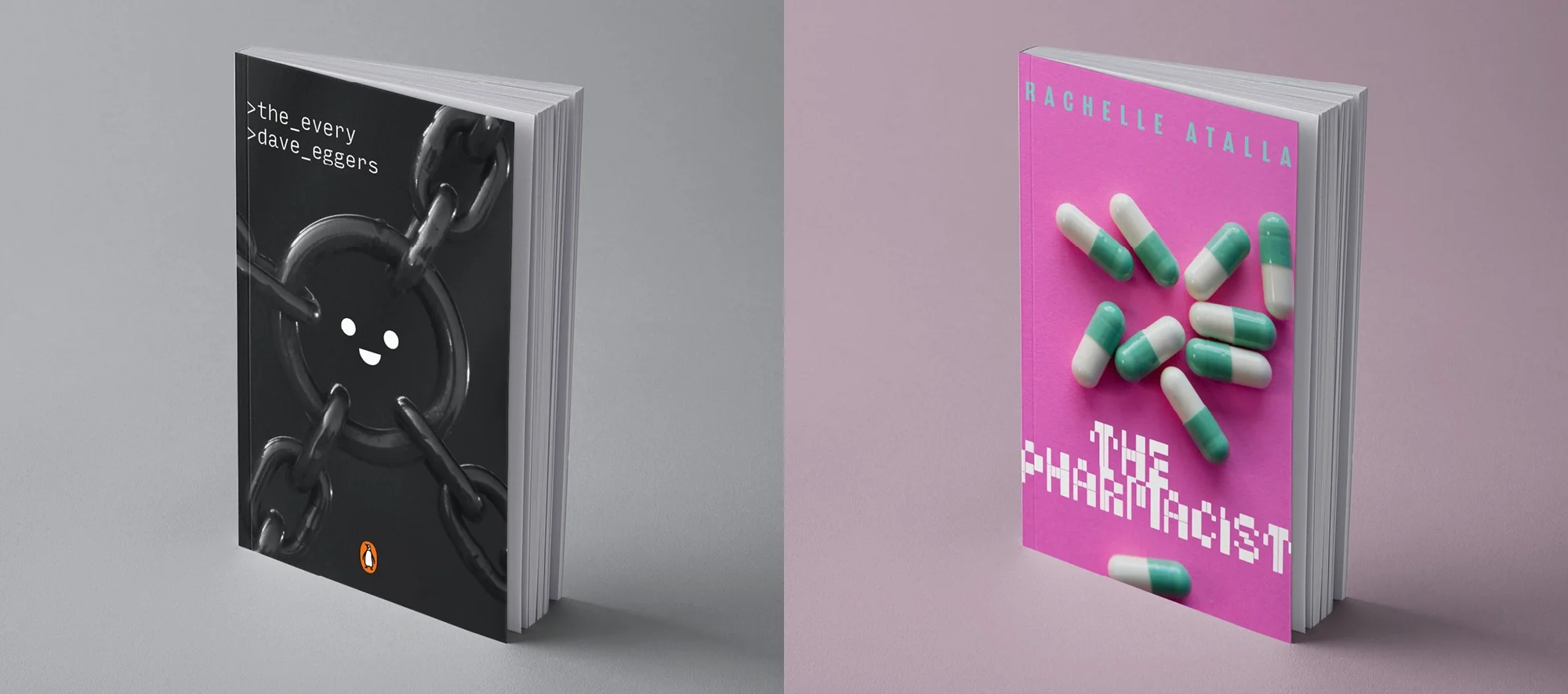
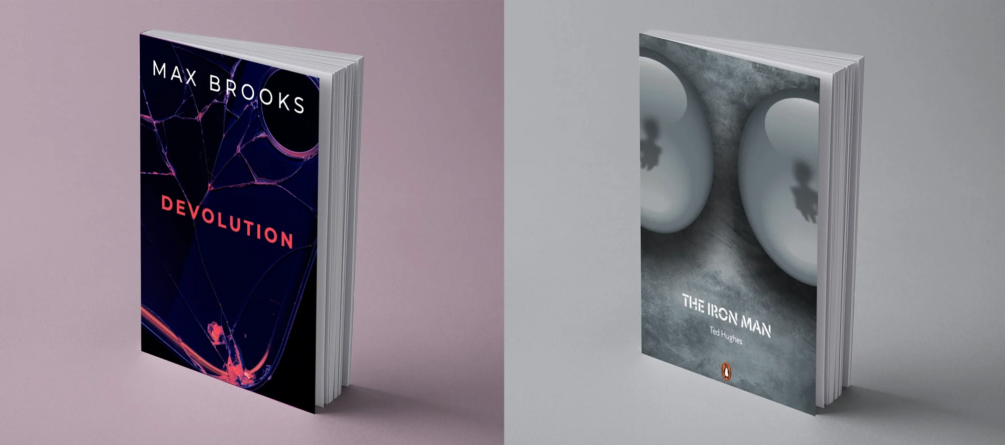
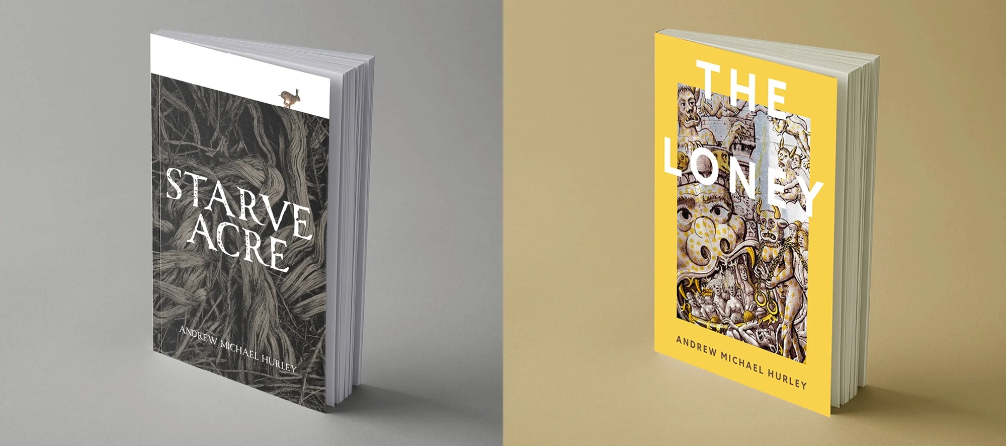
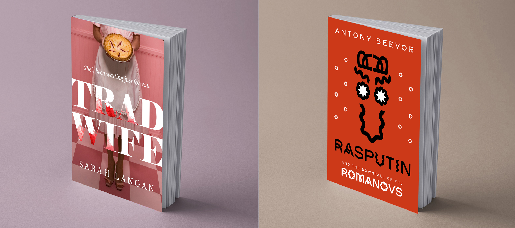
I love to read. When I finish a book I’ve enjoyed, I challenge myself to design a new cover in under 30 minutes, using my own photography where I can.
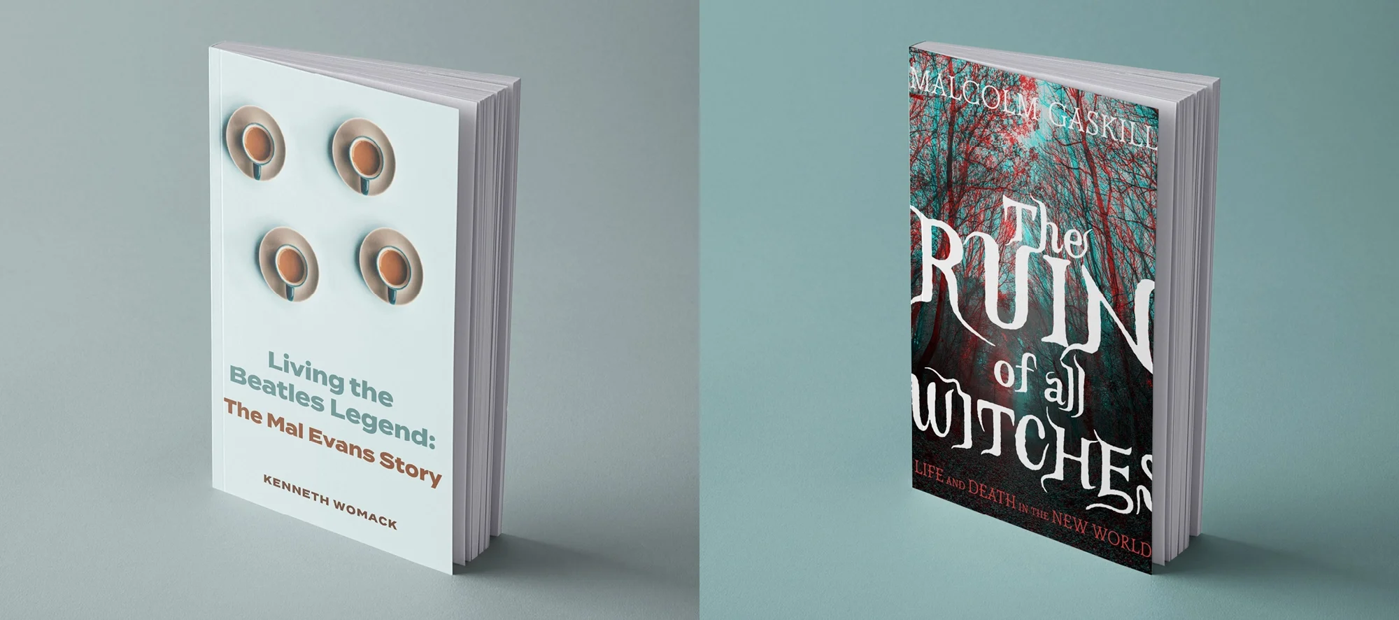
Minimalist book cover design for 'Living the Beatles Legend' by Kenneth Womack, featuring a clean white layout with four tea cups and modern sans-serif typography.
Bold, minimalist book cover for 'Unruly' by David Mitchell, using a vibrant orange background, playful black serif typography, and a 3D scattering of black chess pieces.
Vibrant, pop-art style book cover for 'The Pharmacist' by Rachelle Atalla, utilizing a neon pink background, scattered 3D pill capsules, and a digital, pixelated font.
Cinematic book cover design for 'The Iron Man' by Ted Hughes, featuring a cold, metallic grey texture and two large, reflective 3D spheres with soft shadows.
Two books by Andrew Michael Hurley, one titled 'The Loney' with a yellow cover and artwork of various mythical or fantasy creatures, the other titled 'Starve Acre' with a black and white cover featuring tree roots.
Two books standing upright on a surface. The book on the left, titled "Tradi Wife" by Sarah Langan, has a pink background with an image of a woman holding a pie or cake and wearing a pink apron. The title is in large white and red letters. The book on the right, titled "Rasputin and the Downfall of the Romanovs" by Antony Beevor, has a red background with a black abstract line drawing and text in white and black.